Mastering Timeline Scales: A Guide for Precise Data Analysis

The same sales data can look steady by month and volatile by day. Nothing in the numbers changed. The timeline scale did.
That is the whole problem in one sentence: a chart can be accurate and still mislead, because the way time is spaced, grouped, or compressed quietly decides what readers see.
The fix is to choose the scale to fit the question, not the default. Get it right and the chart becomes easier to read, easier to defend, and more useful in the decision. Get it wrong and good data produces weak judgment, while a team burns the meeting debating whether a trend is even real.
This guide covers what a timeline scale actually is, the main scale types and their tradeoffs, the mistakes that distort interpretation, and how to match the scale to the decision in front of you.
What is a timeline scale? A clear definition for data analysis
A timeline scale is the rule set that maps chronological time to visual space. It governs how dates, durations, intervals, and event positions show up in a chart, dashboard, or report.
Simple definition, heavy consequences. The scale alone decides:
- whether every day gets the same visual width, or busy days get more room;
- whether months are treated as comparable reporting buckets;
- whether sparse events are spaced proportionally or evenly;
- whether business-specific periods like fiscal weeks override the calendar.
That's why it defines what a viewer can compare accurately. On one chart the key comparison is elapsed time between events; on another it's period-over-period totals; on a third it's spotting seasonality or finding where events cluster.
So a timeline scale is a representation choice in its own right. It shapes the kind of time-based reasoning a chart can support, which is why a scale mismatched to the question can leave a polished visual quietly weakening the analysis.
Why timeline scales matter in business and research contexts
Scale selection changes which patterns look important. A compressed annual view flattens operational volatility. A dense daily scale overemphasizes noise. A grouped quarterly chart can make a business look consistent even when execution inside each quarter was uneven.
This shows up across everyday work:
- In forecasting, the scale decides whether a trend line reflects structural movement or short-run wobble.
- In cohort analysis, it sets whether behavior reads by user age, calendar time, or campaign period.
- In project tracking, it influences whether delays look isolated or systemic.
- In executive reporting, it shapes the story leaders carry into budget, hiring, and planning calls.
Most business intelligence work runs into the same problem before anyone touches the numbers: the period on the axis quietly sets what the numbers are allowed to say.
Make the time logic easy to read
There's also a communication payoff. Good scale design lowers cognitive load. People don't have to reconstruct what "this month" means versus "the last 30 days," or guess whether a missing period means no activity or omitted data. The timeline makes the logic legible upfront.
That pays off in reviews, audits, and cross-functional meetings. When time is represented clearly, analysts spend less time defending the chart and more time discussing what it means.
How timeline scales work: The logic behind temporal representation
Timeline scales convert timestamps into positions using a set of interval rules. The simplest version uses equal elapsed time: one hour, day, or month maps to the same amount of visual space. That's what most people picture when they hear "timeline," but it's one option among several.
Choose between elapsed time and reporting periods
Other scales use grouped periods. Instead of preserving exact elapsed time, they sort data into reporting units like weeks, months, or quarters. That's useful when the goal isn't to inspect individual timestamps but to compare standardized periods. A monthly revenue chart cares less about exact gaps between transactions and more about bucketed performance.
Some organizations use variable spacing tied to operating calendars. Retailers align to fiscal weeks. Manufacturers track production cycles. Schools compare terms instead of calendar months. In those cases the scale mirrors how the business actually runs, not universal clock time.
Pro tip: Add the question above the chart before choosing the scale
Before you build the timeline, write the decision question in plain language. “Are sales improving?” may need a monthly or quarterly view. “When did the slowdown start?” may need a daily or weekly view. “How long did users take to convert after signup?” may need a cohort timeline instead of calendar time.
That one sentence protects the analysis from default-chart thinking. If the scale does not help answer the question directly, change the scale before you change the data.
A practical way to think about scale logic is to ask what the timeline is meant to preserve. Some timelines preserve elapsed time. Others preserve reporting periods. Others preserve business logic, such as fiscal weeks, school terms, production cycles, or non-operating days.
Those choices lead into the three main timeline scale types: continuous, discrete, and specialized.
Main timeline scale types and when to use them
|
Scale type |
What it preserves |
Best suited for |
Main risk |
|---|---|---|---|
|
Continuous |
Actual elapsed time between points |
Duration, spacing, timing, trend continuity, event gaps |
Dense data can become cluttered; long ranges can hide short-term changes |
|
Discrete |
Comparable reporting intervals, such as days, weeks, months, or quarters |
Period-over-period reporting, summaries, dashboards, performance comparison |
Aggregation can smooth volatility and hide exact timing |
|
Specialized |
A custom time logic, such as fiscal calendars, skipped weekends, irregular-event order, or logarithmic time |
Business-specific reporting, operating calendars, edge cases, compressed timelines |
Viewers may assume standard calendar time unless the scale is clearly labeled |
Continuous scales
Continuous time scales preserve proportional elapsed time. If two events sit six months apart, that gap looks visually larger than two events a week apart. That makes continuous scales strong for actual duration, the spacing between incidents, long-running trends, and any analysis where timing itself carries meaning. They're often the right call for sensor data, operational incidents, and market prices.
The tradeoff is readability at scale. Dense event streams clutter fast. Long ranges compress local variation. A five-year continuous timeline can be accurate and still bury a short-lived but critical change.
Discrete (interval-based) scales
Discrete scales group time into standard units: day, week, month, quarter, fiscal period. They suit comparative questions rather than continuous ones. Monthly churn, quarterly bookings, and weekly traffic are easier to compare in grouped form because the chart trades raw timestamp detail for clean reporting units.
Aggregation changes the signal, though. It smooths short-term volatility and hides exact timing. That's not automatically bad; often it improves clarity. But a monthly chart and a daily chart of the same data tell different stories, and analysts shouldn't treat them as the same truth.
Pro tip: Show the default view and the diagnostic view separately
One timeline rarely does both jobs well. Use a clean aggregated view for the main reporting story, then keep a more detailed diagnostic view nearby for investigation. For example, a monthly revenue chart can show the trend, while a daily drill-down can reveal whether the movement came from one unusual spike, a late-month push, or a steady change in behavior.
This avoids overloading one chart with too much detail while still giving reviewers a way to test the pattern.
Specialized scales
Specialized scales come out when standard calendar time isn't enough. A logarithmic time scale helps when you compare very short and very long horizons in one view. An irregular-event scale spaces observations evenly even when the underlying events happened unevenly, which helps sequence inspection but breaks duration analysis. Compressed business-calendar timelines drop weekends or non-operating hours to focus on active periods.
These solve real problems, but they demand stronger labeling and more context. The further a chart drifts from common assumptions about time, the more work the analyst has to do to make the logic explicit.
A quick way to frame the tradeoffs:
- Continuous scales handle true timing and duration well, but weaken for high-level comparison across many periods.
- Discrete scales suit period-over-period reporting and lose exact event spacing.
- Specialized scales fit edge cases and operating realities, and get risky when viewers assume standard calendar behavior.
Pro tip: Label non-standard time logic directly on the chart
If the timeline uses fiscal weeks, rolling periods, skipped weekends, irregular sampling, or grouped dates, say so on the chart itself. Do not hide the logic in a dashboard filter or a methodology note nobody reads.
A simple label such as “Grouped by fiscal week,” “Weekends excluded,” or “Rolling 30-day periods” prevents readers from assuming standard calendar time. That small addition can stop a lot of false comparisons before they start.

Common mistakes and misconceptions when interpreting timeline scales
Most timeline mistakes happen when the chart makes time look more exact, more regular, or more comparable than the data supports. Use this as a quick check before a timeline goes into a dashboard, report, or review.
|
Mistake |
Why it misleads |
Better approach |
|---|---|---|
|
Treating monthly, quarterly, and yearly views as the same truth |
Each scale changes what counts as meaningful variation. A quarterly chart can hide mid-quarter disruption, while a daily chart can make routine fluctuation look strategic. |
Compare conclusions only after checking whether the time frame changed the signal. |
|
Adding more labels to “help” |
Dense axis labeling creates clutter. Readers stop seeing the temporal structure and start decoding the axis. |
Label enough points to show rhythm and orientation, not every available timestamp. |
|
Spacing uneven intervals evenly |
Equal visual spacing implies equal time spacing, even when data collection was sporadic or periods were different lengths. |
Use proportional spacing when elapsed time matters, or clearly label the chart as sequence-based. |
|
Truncating the time range |
Starting just before a spike can make an exception look like the beginning of a trend. The time removed from the axis still shapes interpretation. |
Show enough historical context to separate trend, seasonality, and one-off movement. |
|
Plotting estimates as exact dates |
Milestones, forecasts, and confirmed events look equally certain when they use the same visual treatment. |
Style estimates differently and label uncertain timing clearly. |
Research on axis truncation shows how hard these distortions are to correct once viewers have seen them. Across five studies, 83.5% of viewers misjudged the size of differences, and the effect held even after they were taught how truncation works. The same principle applies when a timeline is cropped too tightly: what gets removed from the axis still steers the eye.
Real-world use cases: Where the right timeline scale improves decisions
Financial and sales reporting
Scale choice tracks the audience. Executives usually want quarterly or fiscal-year views, because those match planning cycles, board reporting, and budget accountability. A finance analyst preparing a monthly board pack rolls daily transactions up to the period the board actually reasons in.
But when the same team investigates cash swings or end-of-period behavior, a continuous daily scale reveals far more. It surfaces intraperiod volatility that quarterly totals erase. A sales team reviewing pipeline in a CRM hits the same split: a view grouped by month is fine for forecasting, but diagnosing why a quarter slipped means dropping to deal-level dates.
Product and marketing analytics
Weekly timelines often beat daily ones for campaign response, because they balance signal and noise. A growth analyst reviewing a launch usually looks weekly first, then zooms to daily only when something odd appears.
Cohort timelines work differently. They anchor users by shared start date, which makes retention timing, conversion lag, and release impact comparable. That shifts the question from "What happened on this calendar date?" to "What happened this many days after acquisition?" The change in scale is the change in question.
Research
The right scale separates sequence from duration. A study tracking interventions may need a continuous scale to show exact spacing between treatment and outcome. If the question is cyclical behavior, grouped seasonal or monthly views reveal recurrence better. Pick the wrong one and periodic anomalies look random.
Operations and project tracking
Operations teams hit this constantly. For incident management, a dense hourly or daily timeline shows escalation windows and response timing. For long-running process improvement, that same view is too noisy, and a weekly or monthly scale makes drift, maintenance cycles, and quality shifts visible.
Project tracking has its own version. A Gantt-style project timeline makes dependencies and overlap legible at a glance, but the moment tasks span very different durations, even spacing starts to mislead about which work actually sits on the critical path.
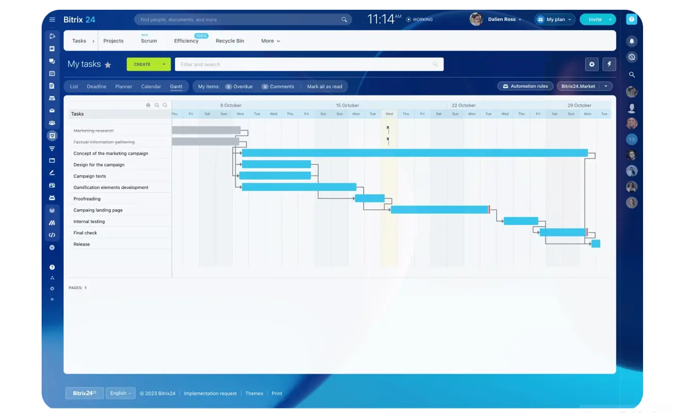
The common thread is fit. A scale chosen to match the decision produces clearer reasoning and a defensible chart at the same time.
Operational impact, scaling considerations, and practical limitations
Scale and rendering load
As datasets grow, timeline design becomes an operational problem. High-frequency timestamps across long ranges overwhelm both the viewer and the system rendering the chart. Aggregation helps, with the familiar tradeoff: readability improves while temporal detail drops. Teams have to decide what belongs in the default view and what lives in drill-down.
Standardization across teams
Standardization matters more than most organizations expect. If one dashboard reports weekly activity by calendar week, another by rolling seven-day windows, and a third by fiscal week, cross-team comparison turns messy fast. People stop comparing performance and start decoding time logic. That drags down recurring reviews and breeds avoidable trend disagreements.
Clear conventions cut that friction. They don't have to be rigid for every chart; they just have to be clear enough that people know what a period means before they read the numbers.
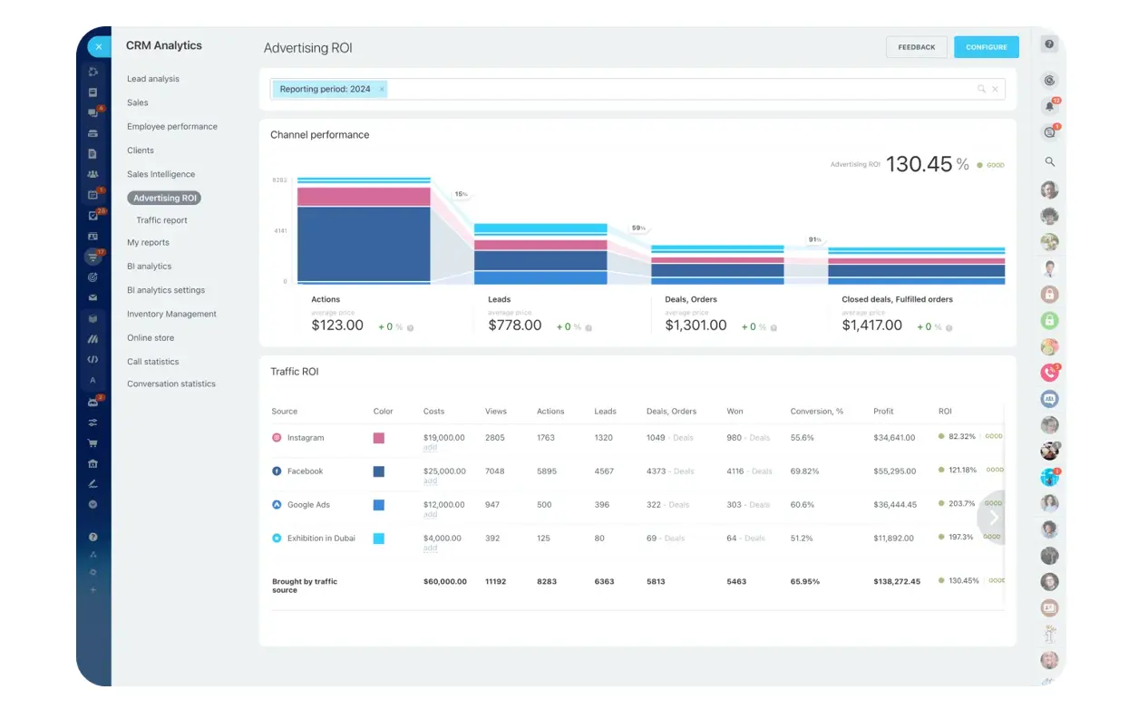
This matters most in executive settings, where people move fast and assume shared definitions. Keeping reporting in one place helps: when analytics and reporting dashboards pull from the same CRM and project data, period definitions stay consistent instead of drifting from tool to tool.
Where it breaks down
No single scale serves every audience. Global reporting brings time-zone complications. Research datasets carry irregular sampling. Operational systems mix event-level timestamps with monthly planning data. Some teams need fiscal calendars that don't line up with standard months; others need side-by-side views at different granularities.
That's where the limits get practical. The "best" timeline scale is conditional. It depends on who's looking, what they're deciding, and whether exact timing or comparable periods matters more. Good analytics systems make that choice explicit instead of pretending one default can answer every question.
Make timeline scale part of the analysis, not an afterthought
Precise analysis depends on more than accurate timestamps. It depends on choosing a timeline scale that fits the question, the audience, and the decision being made.
That choice should happen before the chart reaches a report or review. Ask what the viewer needs to compare: exact timing, period performance, sequence, duration, seasonality, or operational cycles. Then choose the scale that makes that comparison honest and readable.
When the scale fits, the chart becomes easier to read, easier to defend, and more useful in the decision.
When it doesn’t, even good data can produce weak judgment.
Bitrix24 helps teams keep reporting clearer by connecting CRM activity, sales data, tasks, project timelines, and dashboards in one workspace.
Start for free and build reports where the time logic is easier to understand, compare, and act on.
Build clearer reports with the right time logic
Bitrix24 connects CRM, sales, tasks, and dashboards so teams can compare timelines consistently and act on reliable insights.
Get Started NowFAQ
How should irregular timestamps be shown?
Use a continuous scale if the elapsed time between events matters. If the goal is to compare event order rather than duration, an irregular-event or sequence-based display works better. Don't imply equal spacing when the timing was uneven.
What about missing periods?
Missing periods should look different from true zero activity. Otherwise viewers assume nothing happened when the real issue is incomplete collection or excluded data.
How do multiple time zones affect timeline choice?
Match time-zone handling to the question. For local operational analysis, local time may be necessary. For global executive reporting, a standardized reference zone is usually cleaner. Trouble starts when a chart mixes both without telling the viewer.
When do fiscal calendars justify a custom scale?
If the organization plans, measures, and pays against fiscal periods, fiscal time is usually the right reporting frame. A standard calendar view can still help, but it shouldn't replace the operating calendar that drives decisions.
When should analysts switch from continuous to aggregated views?
Usually when detail stops improving interpretation. If dense timestamps make the pattern unreadable, or the audience needs comparison rather than exact event timing, aggregation is doing useful work instead of hiding insight.
Can the same dataset support multiple valid timeline scales?
Yes, and that's normal. The right scale depends on the purpose and the audience. A marketing team, a finance leader, and a researcher can each need a different time representation from the same underlying data.